
Not all complex and new graphs are good.
This Map is Crap.
I have noticed a popular link on Social Media sites that leads to an interactive map. This map shows colorful circles over a world map. With link titles like, “One map sums up the damage caused by the anti-vaccination movement,” it gives the illusion that these explosive circles are the recent result of reduced vaccinations.

I am extremely pro-vaccine, but this is not the type of chart we should look at for the subject of vaccines and preventable disease. Here are some of the key issues with this map:
This chart is not about vaccination.
- Vaccination rates are not pictured at all on this chart.
This is a bad way to visualize data.

- The dots for 1 case are nearly the same size as the dots for 175. Even by sliding the slider through the years, you can’t see if the cases are increasing or not because the dot size is mis-leading. If the authors were more interested in isolated outbreaks than number cases, then it’s still a problem because there are dots for combined outbreaks, as explained below.
- Using the number of cases doesn’t take into account population in that region.
The downloaded data is sloppy and doesn’t match the map.
- The list of sources is various news articles, including articles about the country as a whole, as well as local articles that talk about breakouts in a specific county.
“Leaders at the Centers for Disease Control and Prevention (CDC) are expected to hold a media tele-briefing at 12:30 p.m. Thursday to address the recent spike in measles cases in the U.S. As of November 30, there have been 175 cases reported in 2013.”
WXYZ Deroit News
- I believe that this is shown as a single dot in the center of the US, as if it was a single outbreak in Kansas.
“4 Measles cases confirmed in Orange County: Orange County Health Officials are warning about a measles epidemic that they say is putting everyone in Central Florida at risk.”
WKMG local 6 Orlando
- The whole-country CDC numbers no doubt include the numbers from local municipalities, so they should not BOTH be listed.
- The CDC and the WHO report that there were nearly 2,000 cases of Mumps in the US in 2009, and yet the interactive map shows 12 cases.
- Good data on disease incidence is easily available from the World Health Organization and within the US, the CDC. I don’t know why the authors would use data-mined local news reports when there government departments who professionally tabulate this data.
A New Graph
I made my own chart to address the rates of vaccination and illness rates. I choose to use the US because I live here, and I choose the MMR vaccine because I think that Rubella, Measles, and Mumps are very serious diseases that should be eliminated. My mother contracted Rubella (German measles) while pregnant with my sister in the 1960’s, before the rubella vaccine was available. Beth Ann was born severely retarded, deaf, and nearly blind. This is an extremely serious disease that many young people haven’t even heard of.
For my graph, I used data collected by the CDC and WHO. I took into account the changing population of US by presenting the data as cases per million Americans. You can see my raw data and detailed list of sources here .
Click here to view a large PDF of this graph.

Reflections from this graph
- Based on my own anecdotal experiences, I expected to see a sharp recent increase in unvaccinated toddlers, but I don’t see that.
- I was also amazed to see how serious the Mumps outbreaks in 2006 and 2009 were.
- It’s hard to see a strong correlation in this data between vaccination rates and disease prevalence, but it’s hard to know what type of correlation to expect. I would guess that there would be a time-delay in decreased vaccination and then later an increase in disease. How long of a delay? Another complication is possibility of a threshold effect, where the slightest change in vaccination could have a huge effect for disease.
Future Directions
- Who are these ~10% of unvaccinated kids? Are they vaccine objectors, or are they parents who haven’t bothered to vaccinate their kids yet because they forgot, or because of the cost?
- It would be really informative to see vaccination rates for adults as well. This data is for kids who are past-due for their MMR vaccine, but do they eventually get vaccinated?
- I wish I had data for a longer time span.
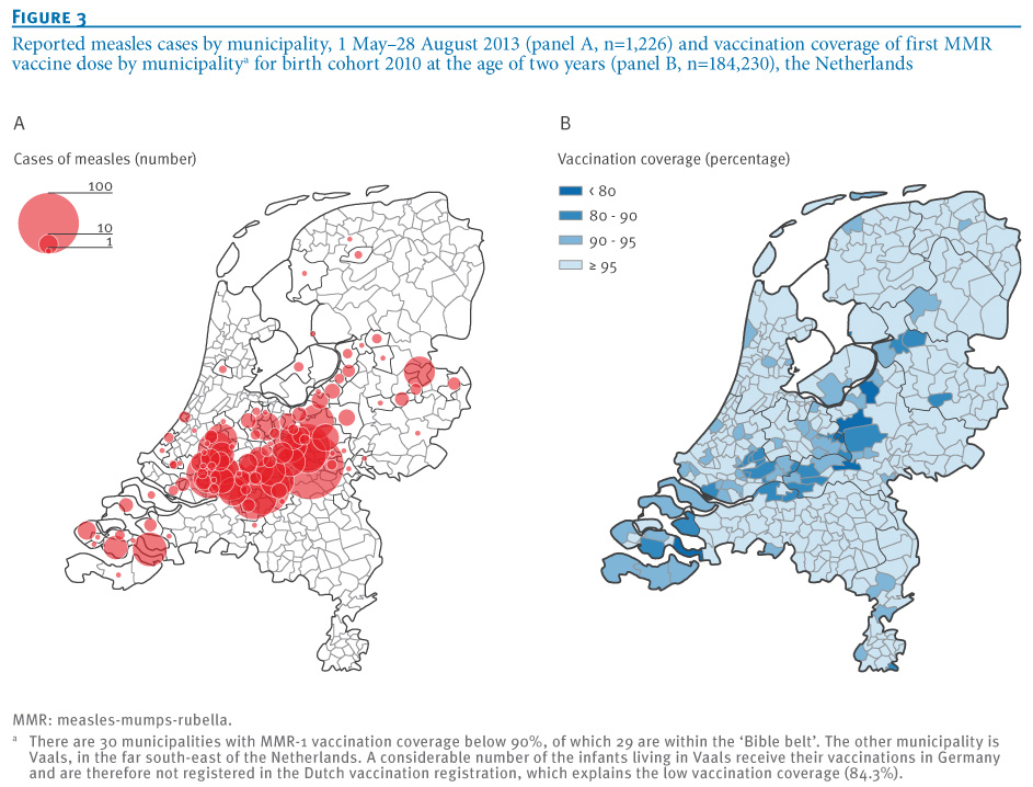
- Small geographic areas of high non-vaccination could have a huge impact on disease. A friend sent me a link to this interesting peer-reviewed map made using highly localized data on both disease and vaccination in the Netherlands. I like this figure because it appears to be carefully and accurately drawn, with each circle representing an individual outbreak.