Curated Color Themes & Schemes for Diagrams & Graphs
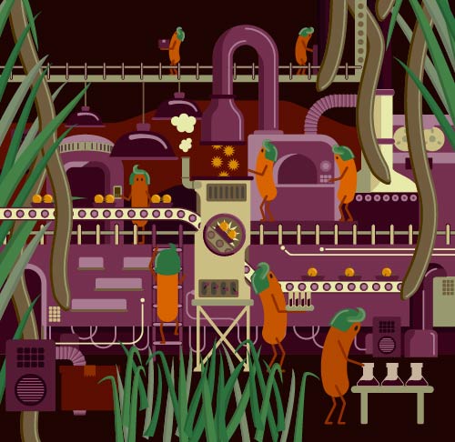
Night Shift
Live forever
Photo by Rhys Moult
4 separate main light colors:
Highlight color:
Light colors with dark text look nice within a Word doc, like in a grant proposal, but a collection of light colors can wind up looking like a pastel easter egg. This color scheme has a a little funkiness that prevents it from looking like a baby shower.
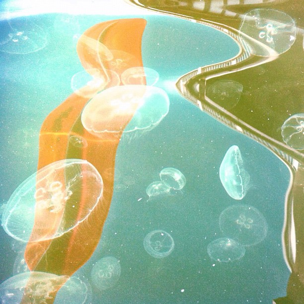
Adobe & Petals
Photo by Carolyn
Highlight color:
General colors:
Light neutral (ideal for call-out boxes):
I've used this general color scheme a lot, and it's always well received.
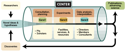
Part of a poster I made for the Mario Izaguirre-Sierra Lab.
Zot Tones
Mt. Sinai Cemetery photo by Christina Rutz
4 separate main dark colors:
These are carefully calculated to represent four equal, distinct programs that complement each other. The intermediate colors are also nice if some items are in-between programs.
Kate Baldwin
